
Overview
Employees had access to trusted financial planners through their workplace—but almost no one was taking advantage.
The journey felt vague, the value unclear, and the process riddled with friction. We set out to close the gap between “I should think about my finances” and “I just booked a call with a planner.”
I led the product vision and end-to-end experience design—from uncovering user needs to optimizing the flow that moved high-intent users into meaningful financial conversations. This meant partnering across engineering, marketing, and the call center to bring a seamless funnel to life.
Tools: Figma, Adobe XD, Miro, Google Analytics
Methods: User Research, Journey Mapping, A/B Testing, Funnel Optimization
The Goal
Drive real financial engagement and real AUM. (Assets Under Management)
We set out to:
Boost user engagement with the Momentum wellness tool
Connect qualified users with financial planners
Increase Assets Under Management (AUM) through a smarter, faster funnel
What We Learned
Money is personal. The journey should be too.
Through qualitative research, we identified a high-opportunity segment: financially stable employees who were unsure where to start.
What mattered most:
Quick value upfront
Personalized insights (not generic advice)
Clear next steps—and minimal friction getting there
Trust, often tied directly to the employer brand

Concepts
Prospect Landing Page (Desktop)

Front Door Marketing/ConfirmID Concepts

Mobile Nav Concepts
The Design
Desktop
We designed a short, conversational checkup that helped users self-identify their financial needs—a quiz that felt more like a friendly conversation. The experience was simple, smart, and reassuring, with every detail crafted to build clarity, trust, and momentum:
Quiz: Engaging, jargon-free questions
Results: Instant feedback with clear action cues
Planner Match: Qualified users ($250K+ AUM) routed directly to a financial advisor
Vetting: Warm handoff to a call center for high-AUM users
UI Design: Focused on clarity, credibility, and ease
Accessibility: Designed mobile-first and inclusive for all users
Employer Co-Branding: Trusted partners like Boeing and Ford boosted user confidence
Conversion Strategy: Strong CTA moments guided users forward
Optimization: A/B tested copy and layout to reduce drop-off and increase opt-ins

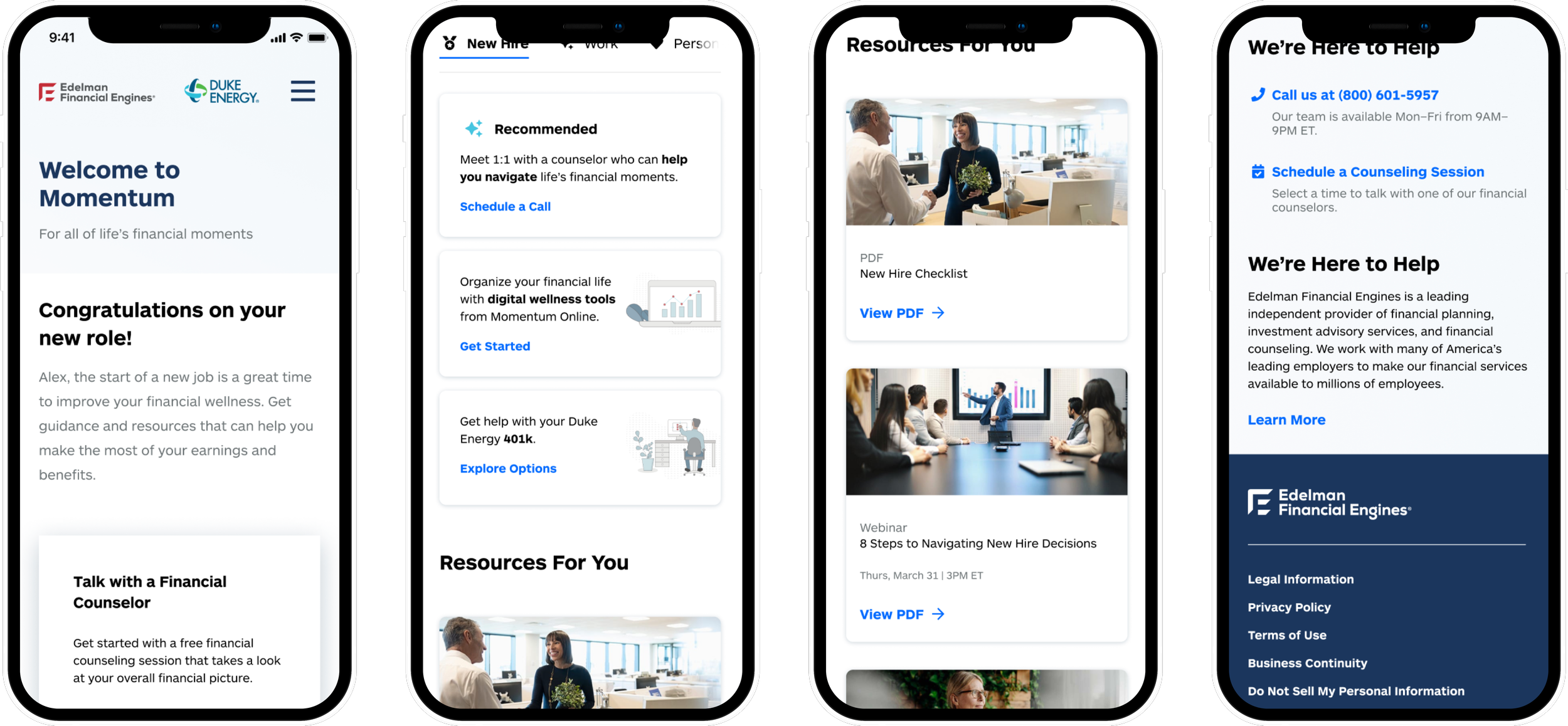
Mobile


The Impact
From quiz to planner—no wasted clicks.
10% quiz completion rate
1% of completers routed to call center
50% of those connected with a planner
$4M in new Assets Under Management
20% increase in workplace conversions in just 2 quarters
Reflections
Friction kills momentum. Personalization fuels it.
Users act when they understand what’s at stake
The right copy, timing, and handoff makes or breaks conversion
Employer trust is a powerful (and underused) UX lever
Next, the focus shifted towards expanding employer partnerships, tailoring insights based on behavioral data, and testing financial incentives to keep users engaged and moving forward.